
Text-to-Image Prompts for Social Media: A Practical Template
Build social-media image prompts around the subject, composition, ratio, and copy space instead of adding vague style words.
 Jordan Brooks
Virtual editorial column · Social creative and prompts
MediaMuse editorial content; the profile image is AI-generated and does not represent a real customer, independent reviewer, or named human expert.
AI-assisted content checked against the current MediaMuse product workflow; it is not an independent product review.
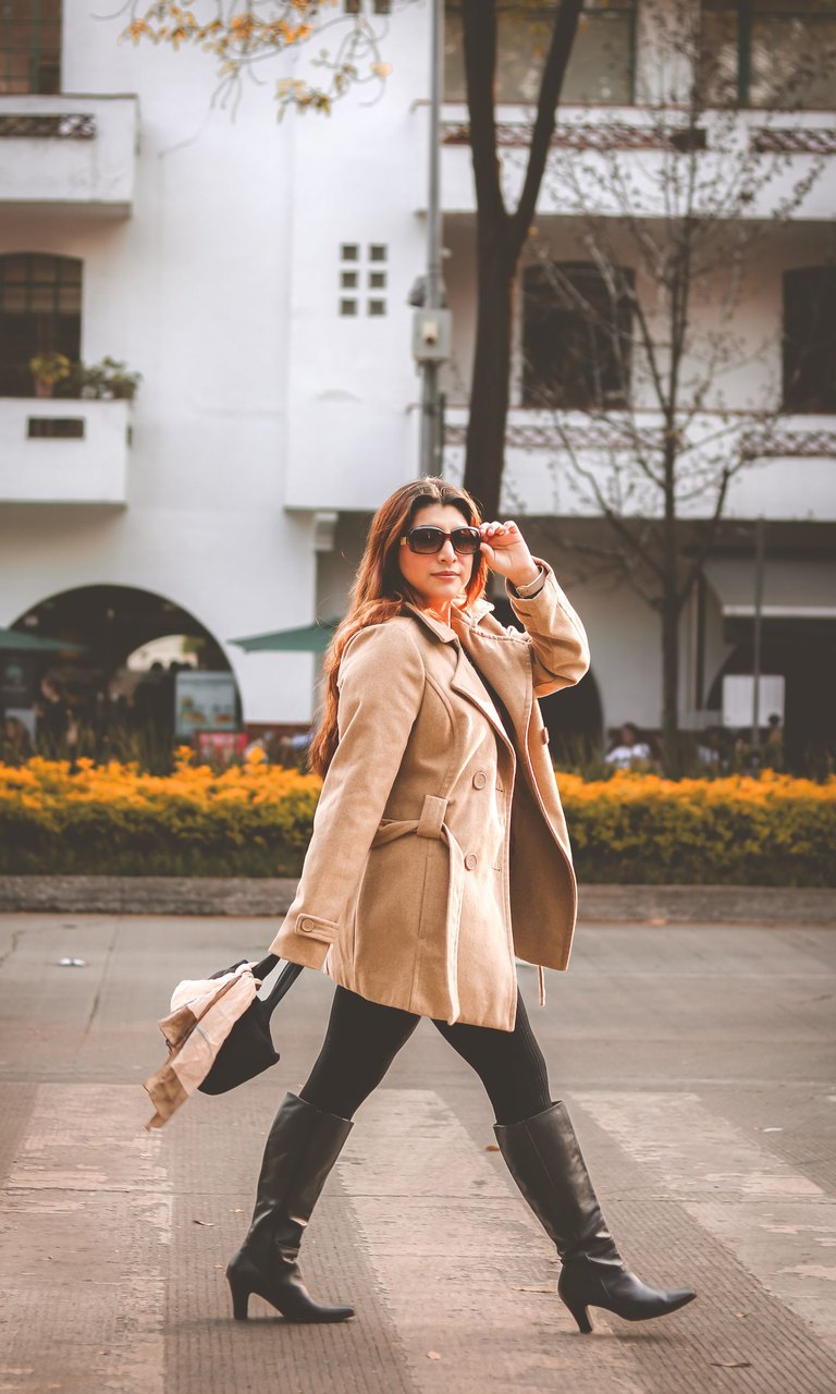
Social images work when the composition survives a fast scroll. The prompt should therefore describe the job of the image first: what is the subject, where should the eye land, what area should stay quiet, and which aspect ratio matches the placement?
Use MediaMuse text-to-image to test a small set of directions. The current Composer offers 1:1, 16:9, 9:16, and 4:3 ratios, plus output count and style controls. Start with one clear composition before asking for a larger batch.
A four-part prompt template
Create a [content type] for [audience or campaign].
Main subject: [subject, action, material, color].
Composition: [close-up or wide], [subject position], [negative space for copy].
Light and mood: [lighting], [palette], [emotional direction].
Ratio: [1:1 / 16:9 / 9:16 / 4:3]. Avoid: [extra objects, unreadable text, watermark].
For a vertical launch post:
Create a vertical social launch image for a calm skincare brand.
Main subject: one frosted glass bottle on a pale stone tray, soft green label area,
small botanical accent. Composition: portrait crop, bottle in the lower two-thirds,
clean upper space for a short headline. Light and mood: diffused morning light,
warm neutral palette, quiet and premium. Ratio: 9:16. Avoid extra bottles,
misspelled words, fake logos, and watermark.
The template separates decisions that are often mixed together. If the result feels busy, change composition or the number of objects before adding more style adjectives.
Match the ratio to the placement
- 9:16: stories, reels, and full-screen mobile placements. Reserve a safe area near the top and bottom.
- 1:1: profile grids, product tiles, and square campaign variations.
- 4:3: presentations, blog cards, and spaces that need a little more horizontal room.
- 16:9: video thumbnails, landing-page banners, and wide social previews.
The ratio is a layout decision, not a quality setting. Generate in the ratio you plan to publish so you can judge the real crop.
Handle text and brand details carefully
Image models can suggest poster-like typography, but generated words may be inconsistent. Ask for a quiet copy area and add final campaign text in a verified design tool. Do not rely on a generated logo, price, disclaimer, or legal label without checking it character by character.
If you have a product photo or a reference composition, use image-to-image instead of describing every physical detail from scratch. For a clean cutout, remove the background first with Background Remover, then create the social scene.
A quick review loop
Generate one direction, ask three questions, and only then branch:
- Can a viewer identify the subject in one second?
- Is the intended copy area actually quiet enough?
- Does the crop work on the target screen without hiding the subject?
This loop produces fewer throwaway images and gives the next prompt a concrete change to make.